How to Make Pixel Art: A Beginner's Guide
Canvas sizes, colour, shading, outlines and scaling — the decisions that make a sprite read, and the beginner mistakes that stop it.
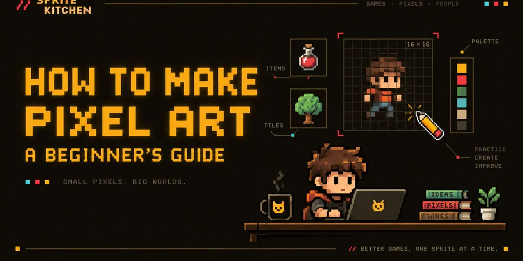
Pixel art looks simple at first.
After all, how hard can it be to place a few colored squares on a screen?
Then you try making your first character, tree, sword, or house — and suddenly nothing looks quite right.
That is completely normal.
Pixel art is not about drawing with tiny squares. It is about making deliberate decisions with a very limited amount of space, color, and detail.
In this beginner’s guide, you will learn the basic principles of pixel art, which canvas size to use, how to choose colors, how to avoid common mistakes, and how to create your first simple sprite.
What Is Pixel Art?
Pixel art is a digital art style where images are created and edited at the individual pixel level.
Unlike regular digital painting, pixel art usually uses:
- Small canvas sizes
- Limited color palettes
- Hard edges
- No anti-aliasing or very controlled anti-aliasing
- Intentional pixel placement
Every pixel matters.
A single misplaced pixel can completely change the shape of an eye, a sword, or even the pose of a character.
That limitation is exactly what makes pixel art interesting.
What Do You Need to Make Pixel Art?
You do not need expensive software.
Almost any image editor that allows you to draw individual pixels can work.
Popular options include:
- Aseprite
- LibreSprite
- Piskel
- GraphicsGale
- Krita
- Photoshop
For beginners, Aseprite is one of the most popular choices because it was designed specifically for pixel art and sprite animation.
If you want a completely free option, LibreSprite and Piskel are good places to start.
The most important tool is not the software.
It is the Pencil Tool.
Avoid soft brushes when creating pixel art.
You want every pixel to have a clear and predictable position.
1. Start With a Small Canvas
One of the biggest beginner mistakes is starting with a huge canvas.
You might think:
A bigger image gives me more room to draw.
Technically, yes.
But it also gives you more pixels to control.
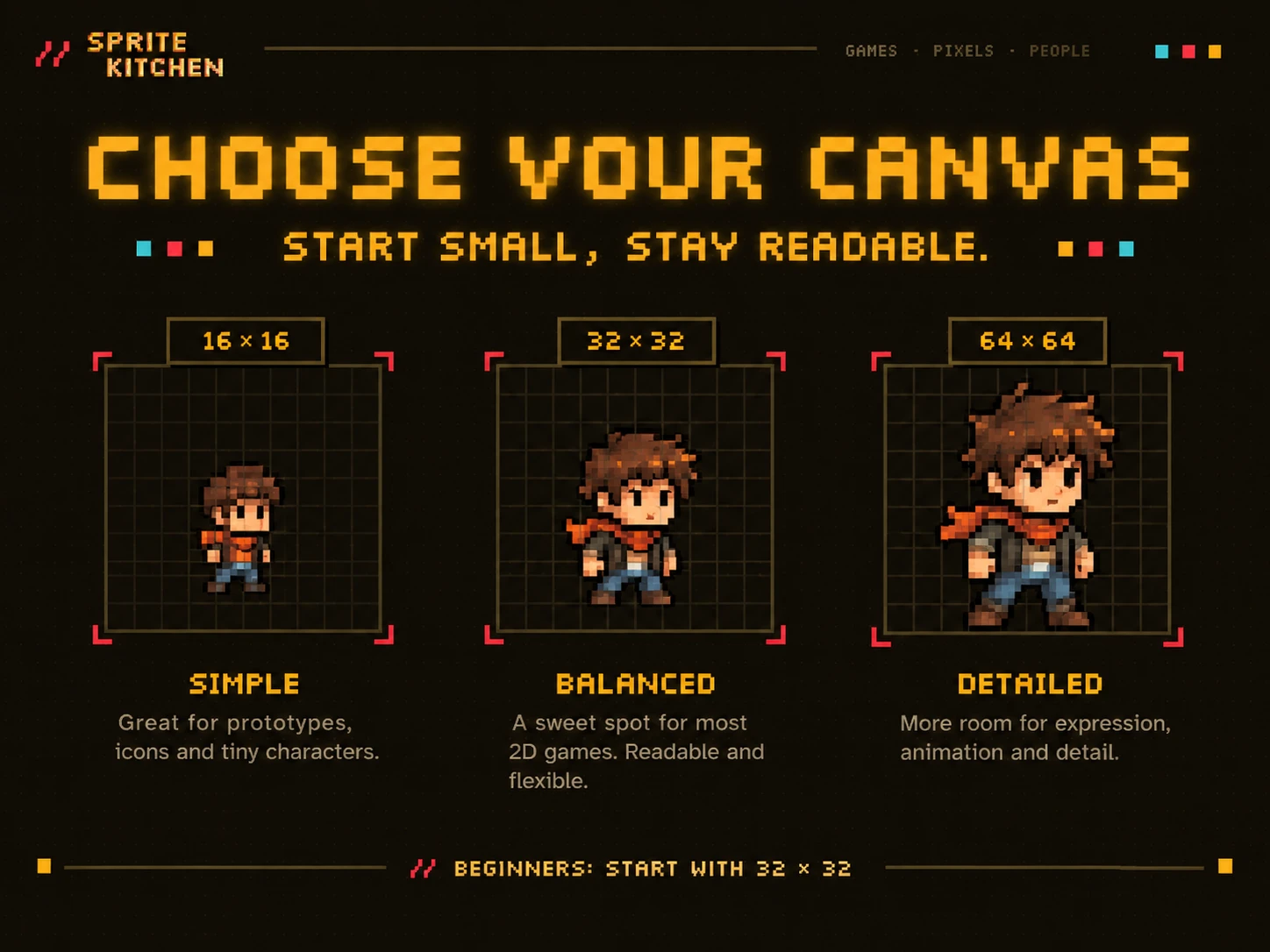
For your first sprites, try:
16×16 pixels
or
32×32 pixels
A 16×16 canvas forces you to simplify everything.
A character might only have a few pixels for its head.
That sounds limiting, but it teaches one of the most important skills in pixel art:
simplification.
For most beginners, I recommend starting at:
32×32 pixels
It gives you enough room to create recognizable objects without becoming overwhelming.
2. Turn Off Anti-Aliasing
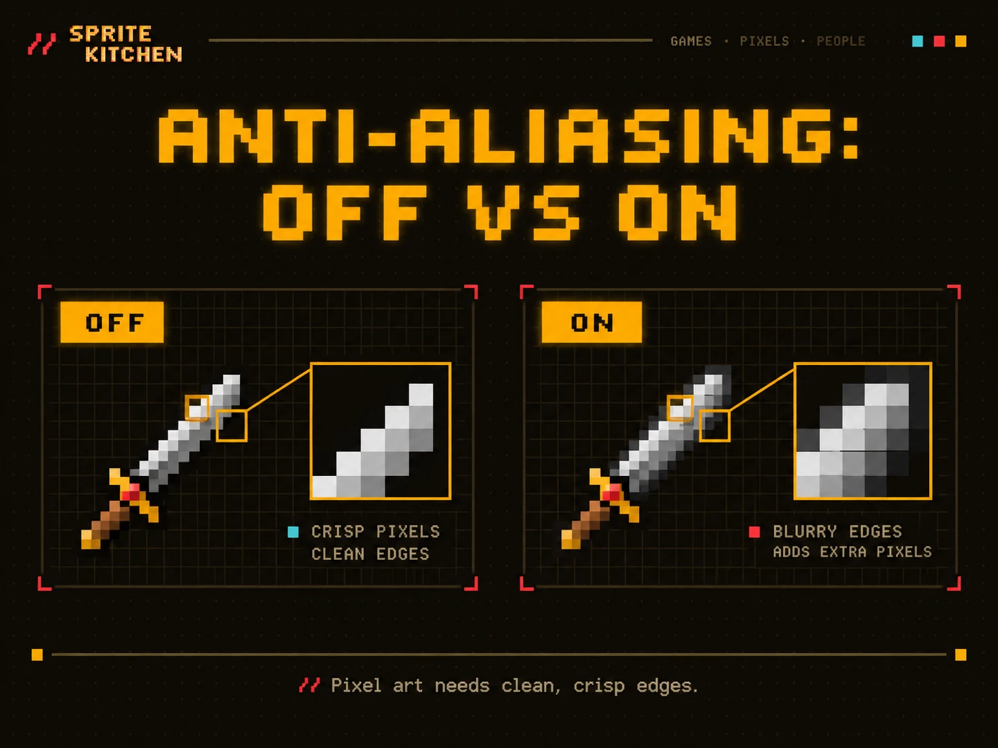
Anti-aliasing creates partially transparent pixels around edges to make lines appear smoother.
That is useful in normal digital artwork.
It is usually undesirable in pixel art.
Imagine drawing a black line on a white background.
With anti-aliasing, the software may automatically generate gray pixels around the line.
Instead of this:
■■■■■■you may get something closer to:
░▒■■■■▒░Those extra pixels can make your pixel art look blurry.
Use a hard pencil brush with:
1 pixel size
and:
Anti-aliasing OFF
3. Draw the Silhouette First
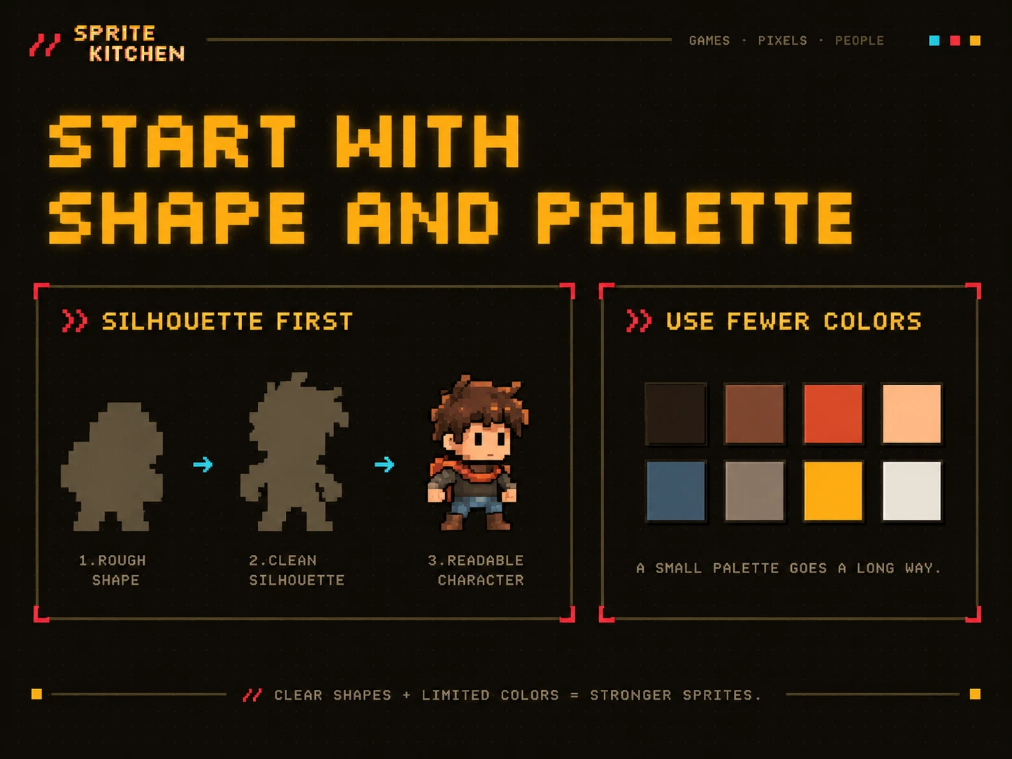
Before adding eyes, clothing, shadows, weapons, or other details, focus on the overall shape.
This is called the silhouette.
For example, imagine you are creating a small warrior.
Instead of immediately drawing the face and armor, first create a single-color shape representing:
- Head
- Torso
- Arms
- Legs
Zoom out.
Can you tell what the object is?
If your character only looks good when zoomed in at 800%, the silhouette probably needs improvement.
Good pixel art should remain readable at its intended display size.
4. Use Fewer Colors
Beginners often use too many colors.
More colors do not automatically create more detail.
In fact, they can make your sprite harder to read.
For a simple character, you might only need:
- 1 outline color
- 2 skin colors
- 2 clothing colors
- 2 or 3 additional colors
That can already produce a surprisingly detailed sprite.
Try starting with somewhere around:
6–12 colors
for a simple sprite.
Later, you can experiment with larger palettes.
5. Choose Colors by Value, Not Just Hue
One of the easiest ways to improve pixel art is to understand value.
Value refers to how light or dark a color is.
Consider three shades of blue.
They might technically be different colors, but if their brightness is nearly identical, the player may barely notice the difference.
Your shadows should generally be noticeably darker than your base color.
Your highlights should be noticeably lighter.
For example:
Highlight
   ↓
Light Blue

Base
   ↓
Medium Blue

Shadow
   ↓
Dark Blue
You do not need dozens of intermediate shades.
Clear contrast usually works better.
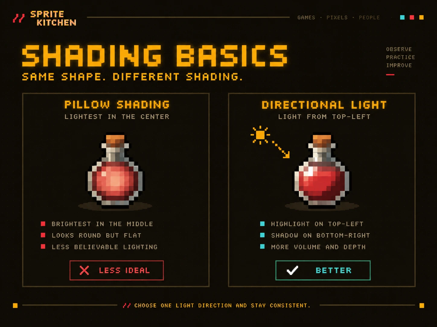
6. Avoid Pillow Shading
One of the most common beginner mistakes in pixel art is something called pillow shading.
Pillow shading happens when you make the center of an object bright and progressively darken the edges.
Something like:
Dark
 ↓
███████
█▒▒▒▒▒█
█▒▓▓▓▒█
█▒▓▓▓▒█
█▒▒▒▒▒█
███████
It often makes objects look flat and artificial.
Instead, imagine where the light is coming from.
For example:
Light source: upper left
Then:
- Top-left surfaces receive highlights
- Bottom-right surfaces receive shadows
This instantly makes objects feel more three-dimensional.
7. Pick a Light Direction
Before shading, decide where the light is coming from.
A very common choice is:
Top-left
Imagine a small sun somewhere above and to the left of your sprite.
Surfaces facing that direction become brighter.
Surfaces facing away become darker.
Keeping the same light direction across your game is important.
Otherwise, characters and environments can look like they belong in different scenes.
8. Be Careful With Outlines
Black outlines are common in pixel art, but they are not mandatory.
A thick black outline can make a sprite easier to read against complicated backgrounds.
But pure black everywhere may also make the sprite look harsh.
An alternative is called selective outlining.
Instead of using the same outline color everywhere, you use darker versions of nearby colors.
For example:
DARK RED
RED
RED
DARK RED
This can create a softer and more polished result.
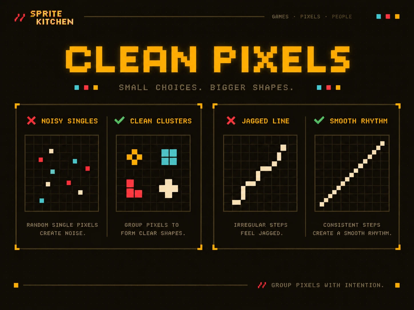
9. Avoid Too Many Single Pixels
A single pixel can be extremely powerful in pixel art.
But too many isolated pixels can create visual noise.
Beginners sometimes add random pixels because the image feels empty.
This usually makes things worse.
Try grouping pixels into clear shapes.
These groups are often called pixel clusters.
Good pixel art relies heavily on clean clusters.
10. Watch Your Jagged Lines
Diagonal lines can be surprisingly difficult in pixel art.
Suppose you create a staircase pattern like this:
■
 ■
  ■
   ■
That produces a consistent diagonal.
Try to keep the rhythm of your pixels consistent.
For example:
1 pixel right
1 pixel down
Or:
2 pixels right
1 pixel down
Consistency makes curves and diagonal lines look much cleaner.
11. Do Not Zoom In Forever
Most pixel art programs allow you to zoom extremely close.
That is useful while editing.
But you should constantly check your sprite at:
100% scale
Why?
Because that is closer to how players will actually see it.
A face that looks amazing at 1600% zoom may look like random noise at normal size.
A useful workflow is:
- Draw zoomed in.
- Check at 100%.
- Adjust.
- Repeat.
12. Start With Simple Objects
Do not make your first pixel art project a giant RPG boss with armor, wings, fire effects, and twelve animation states.
Start smaller.
Good beginner objects include:
- Sword
- Potion
- Coin
- Apple
- Tree
- Rock
- Crate
- Slime
- Mushroom
These objects teach shape, lighting, color, and shading without becoming overwhelming.
Once you understand those principles, characters become much easier.
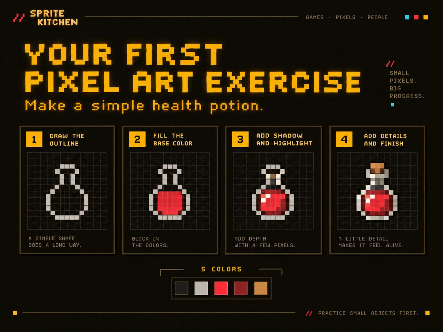
Your First Pixel Art Exercise
Let’s create a simple health potion.
Start with:
Canvas: 16×16 pixels
Use five colors:
- Dark outline
- Dark red
- Bright red
- Light red
- Cork color
First, draw the silhouette of a small bottle.
Then fill the lower portion with red.
Add a darker shade on the bottom-right.
Add a brighter highlight on the upper-left.
Finally, add a small cork at the top.
That simple object already teaches:
- Silhouette
- Color palette
- Lighting
- Highlights
- Shadows
- Pixel clusters
This is why small objects are excellent practice.
How Should You Scale Pixel Art?
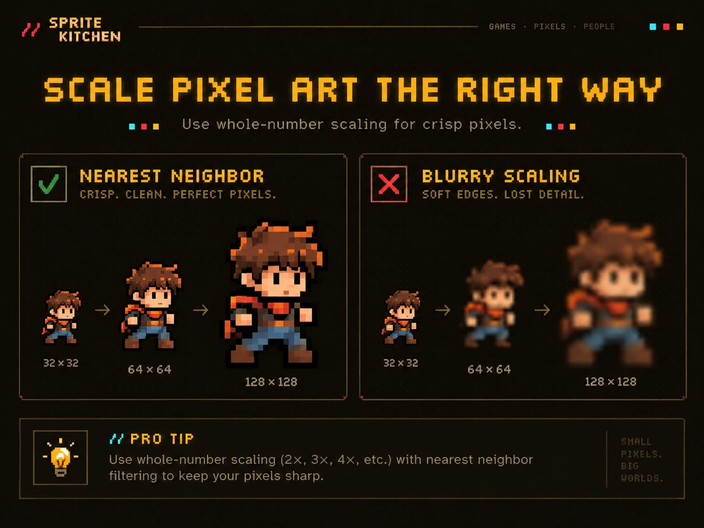
Never resize pixel art using normal smooth scaling.
For example, if you resize a 32×32 sprite to 256×256 using bilinear interpolation, the image may become blurry.
Instead, use:
Nearest Neighbor
You should also preferably scale using whole numbers.
For example:
32×32
↓ 2x
64×64

↓ 4x
128×128

↓ 8x
256×256
This keeps every original pixel perfectly square.
Common Pixel Art Beginner Mistakes
Almost everyone makes these mistakes at first.
The most common are:
- Using too many colors
- Starting with a canvas that is too large
- Using blurry brushes
- Leaving anti-aliasing enabled
- Adding random details
- Using inconsistent lighting
- Over-shading everything
- Ignoring the silhouette
- Using inconsistent pixel sizes
- Only looking at the artwork while heavily zoomed in
If your first sprites look strange, that does not mean you are bad at pixel art.
Pixel art is a skill.
It improves surprisingly quickly once you begin noticing these patterns.
Should Pixel Art Pixels Always Be the Same Size?
Yes.
Inside a single sprite, the pixel grid should normally remain consistent.
One common beginner mistake is combining pixel art created at different resolutions.
For example, imagine a character designed at 32×32.
Then you create a sword at 128×128 and shrink it.
Even if both technically use pixels, the pixel density may look completely different.
Choose a base resolution and stick with it.
What Resolution Should Beginners Use?
A good starting point is:
16×16 for very simple retro-style graphics.
32×32 for most beginner characters and objects.
64×64 for more detailed characters.
There is no universally correct size.
What matters is consistency.
A 16×16 game can look beautiful.
A 64×64 game can also look terrible.
Resolution is not quality.
Good design is quality.
Pixel Art Gets Easier When You Think in Shapes
Do not think:
I need to draw a human hand.
Think:
I need a small cluster of pixels that reads as a hand.
That mindset changes everything.
Pixel art is often more about visual suggestion than accurate representation.
At low resolutions, the viewer’s brain fills in missing information.
That is one of the reasons pixel art can communicate so much using so little.
Practice Is More Important Than Perfection
Your first sprite probably will not look exactly how you imagined it.
Neither will your tenth.
That is fine.
The best way to improve is to create many small sprites instead of spending ten hours trying to perfect a single one.
Try this exercise:
- Day 1: Sword
- Day 2: Potion
- Day 3: Tree
- Day 4: Slime
- Day 5: Treasure chest
- Day 6: Character
- Day 7: Small environment
At the end of the week, compare your first sprite with your last one.
You will probably notice improvements already.
Final Thoughts
Pixel art is easy to start and difficult to master.
But you do not need to master it before creating a game.
Start small.
Use a limited palette.
Focus on silhouettes.
Keep your lighting consistent.
Avoid unnecessary pixels.
And most importantly:
finish sprites.
A folder containing fifty imperfect finished sprites will teach you far more than one unfinished masterpiece.
Your pixels do not need to be perfect.
They just need to communicate.
And that is where good pixel art begins.